I’ve shown you many examples of people doing inclusive tech wrong, from large companies like Apple and Microsoft to smaller outfits like the 2Do team. But some people are doing it right.
Dropbox labels the English, Spanish and Chinese variants when two versions are available, and marks Norwegian (Bokmål) and Brazilian Portuguese because those disambiguations help. All languages are listed using their own names and are alphabetised according to those names, not their English ones. Ukrainian is marked as a beta, indicating that the translation may be incomplete. No flags are used next to the language names. They’ve improved quite a bit since the days when they had an unchangeable US date format when using the English version.

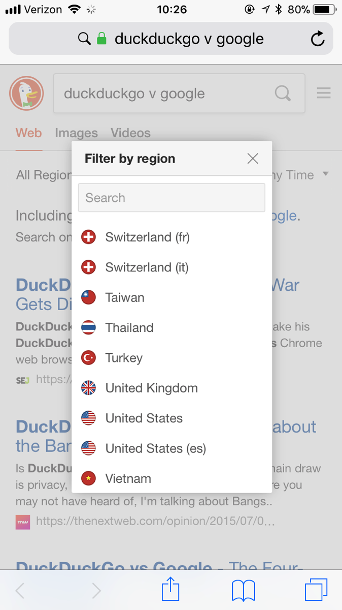
DuckDuckGo uses flags for countries, not languages. Also, they realise that languages other than German are used in Switzerland – the portion of my country selector shows Italian and French options for Switzerland. Similarly, the United States has both English and Spanish options. DuckDuckGo’s options also allow users to change the UI font for the search engine, and there are several options available: the default Proxima Nova, Helvetica, Arial, Verdana, a few other system fonts and a free-choice box that allows you to choose something you have installed on your system. Some people benefit from using different kinds of fonts in the UI, so this is good for accessibility.

The Hoefler & Co type foundry has a section where the designers showcase their typefaces in action, called DiscoverTypography. One of the showcases includes a series of tips about making apps more usable for multiple users. I doubt the sample would work well with a screenreader, but if you can access the page, you’ll find advice about making apps usable for colour-blind people, using visual hierarchy to improve understanding, and avoiding filling apps with unnecessary text to make localisation easier.
Google’s Noto font family, developed by Monotype, is designed to accommodate 800 languages and 100 writing systems within a single font family. Emma Tucker wrote an exhaustive case study about the work the design team put into ensuring that the fonts would accurately reflect people’s languages, culture and history.